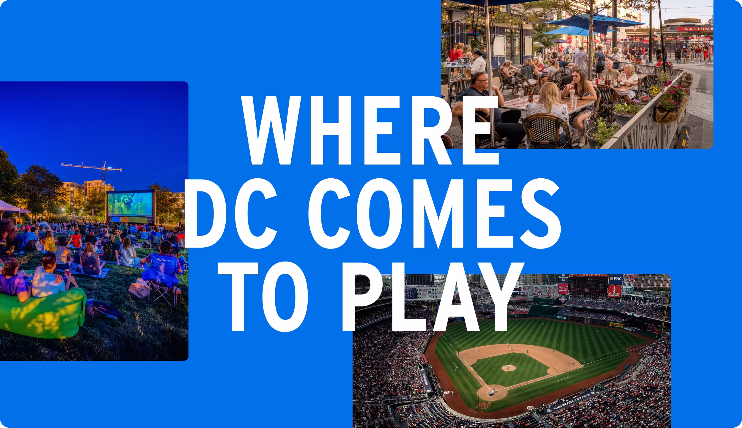
Navy Yard: Where DC Comes to Play
Client
Navy Yard BID
Year
2026
Team
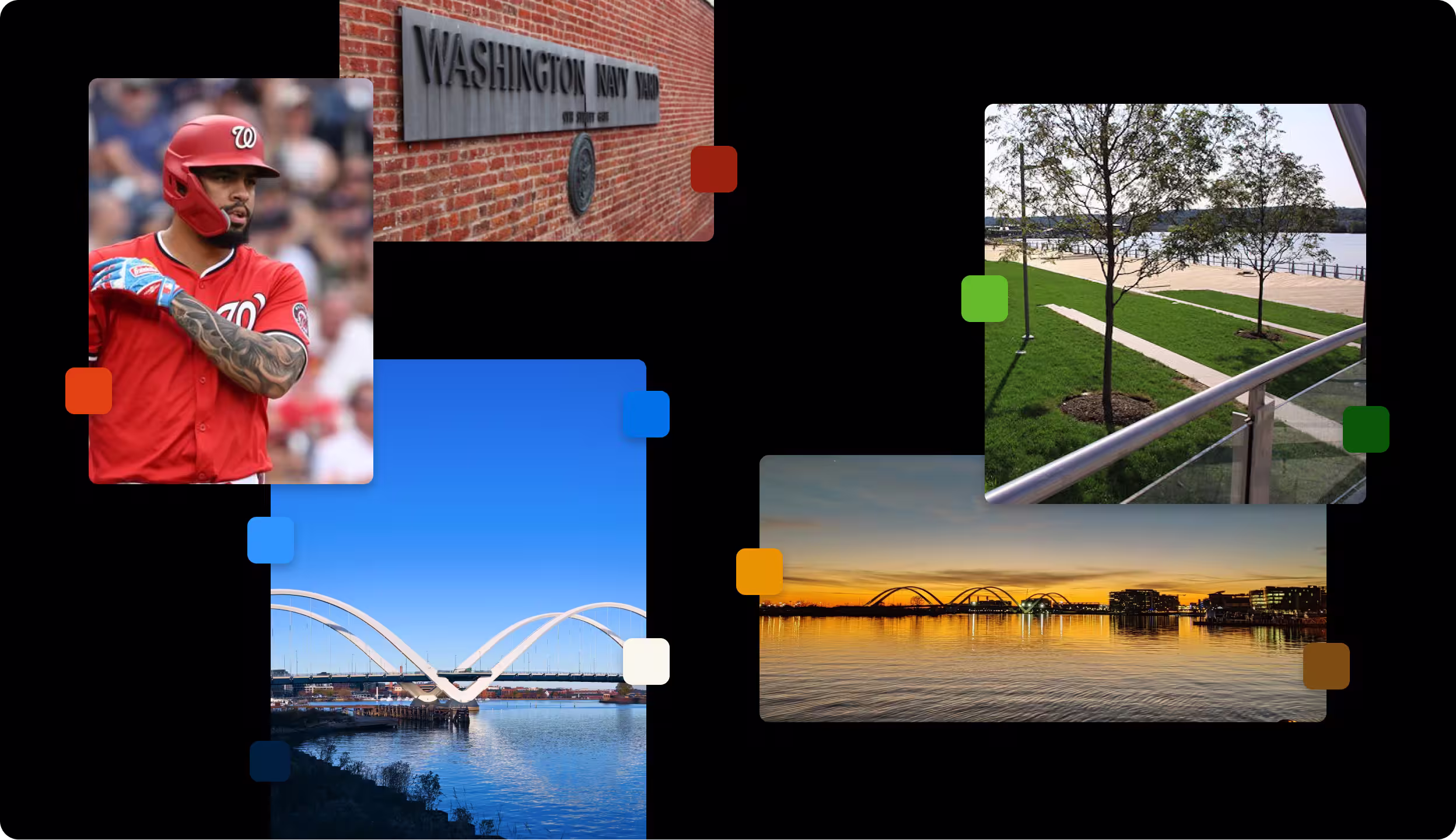
The Navy Yard BID, formerly known as Capitol Riverfront BID, manages over 500 acres of neighborhood in Southeast DC. Having managed the neighborhood since 2007, the BID saw a burgeoning identity crisis in how to best represent all of the things the community had to offer.
Brand strategy approach
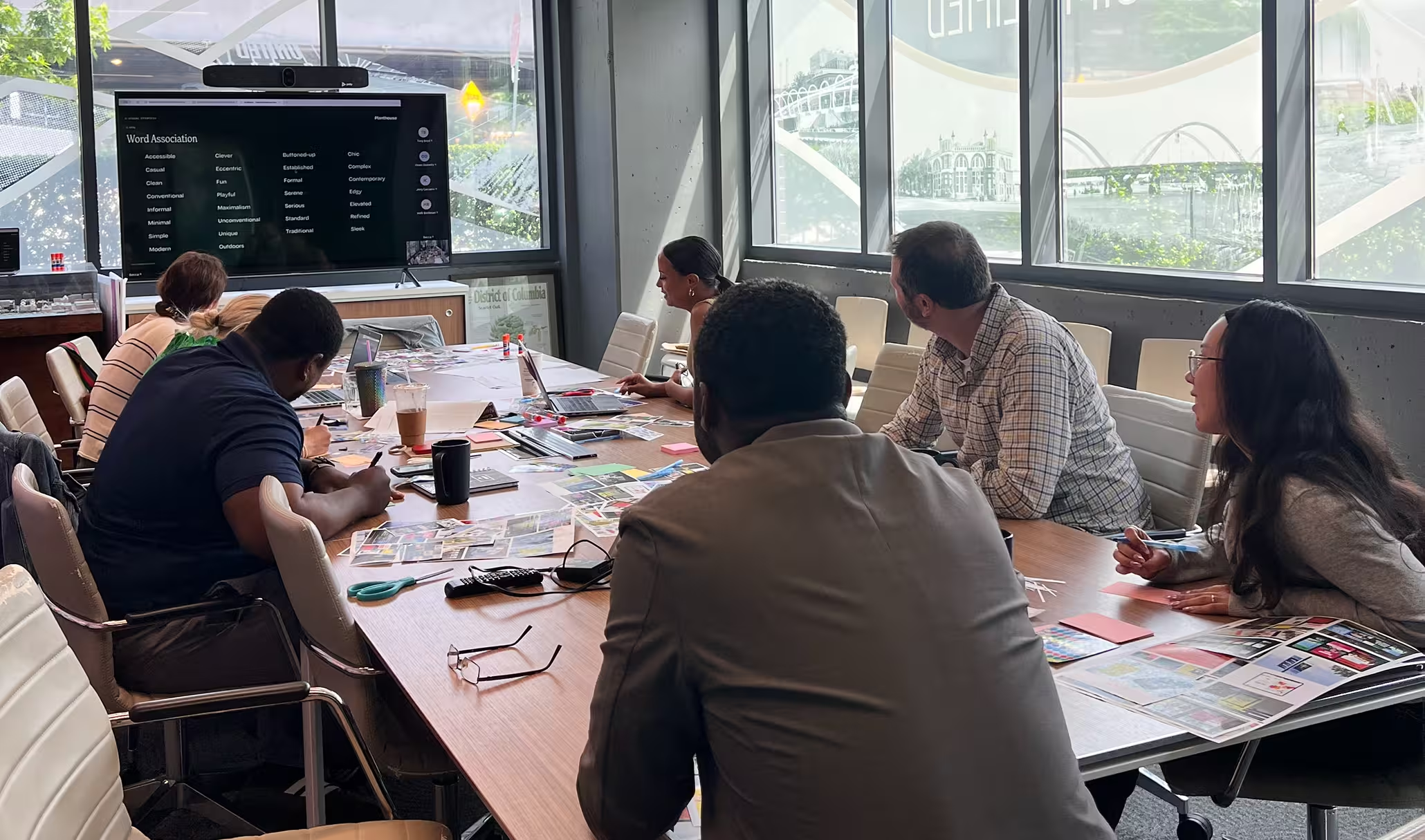
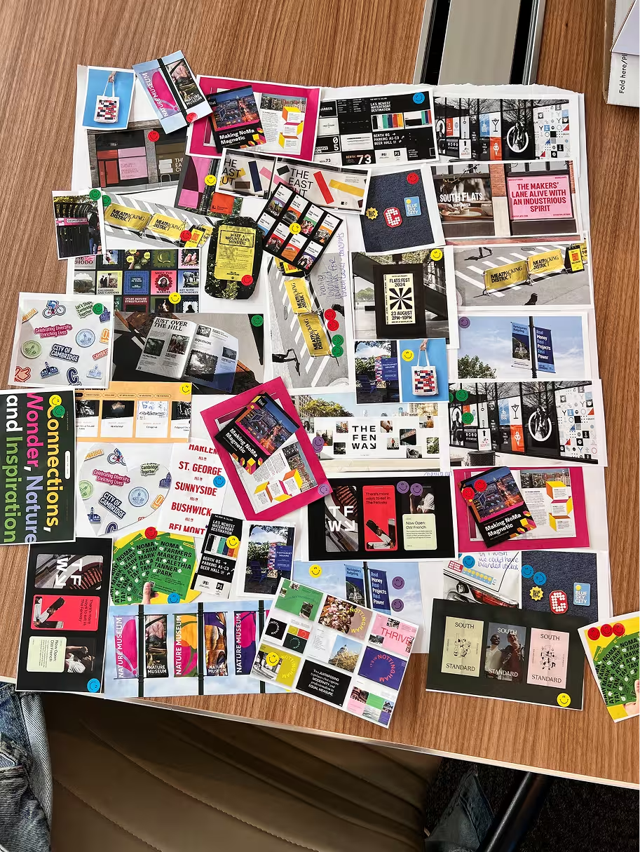
After nearly two decades as Capitol Riverfront, the neighborhood had outgrown its name. Residents, businesses, and visitors already called it Navy Yard—but the brand hadn't caught up. We led a collaborative discovery process, facilitating in-person workshops, community surveys, focus groups, and stakeholder conversations to understand how people experience this riverfront community today and what they want it to become. Those insights shaped every creative decision that followed.
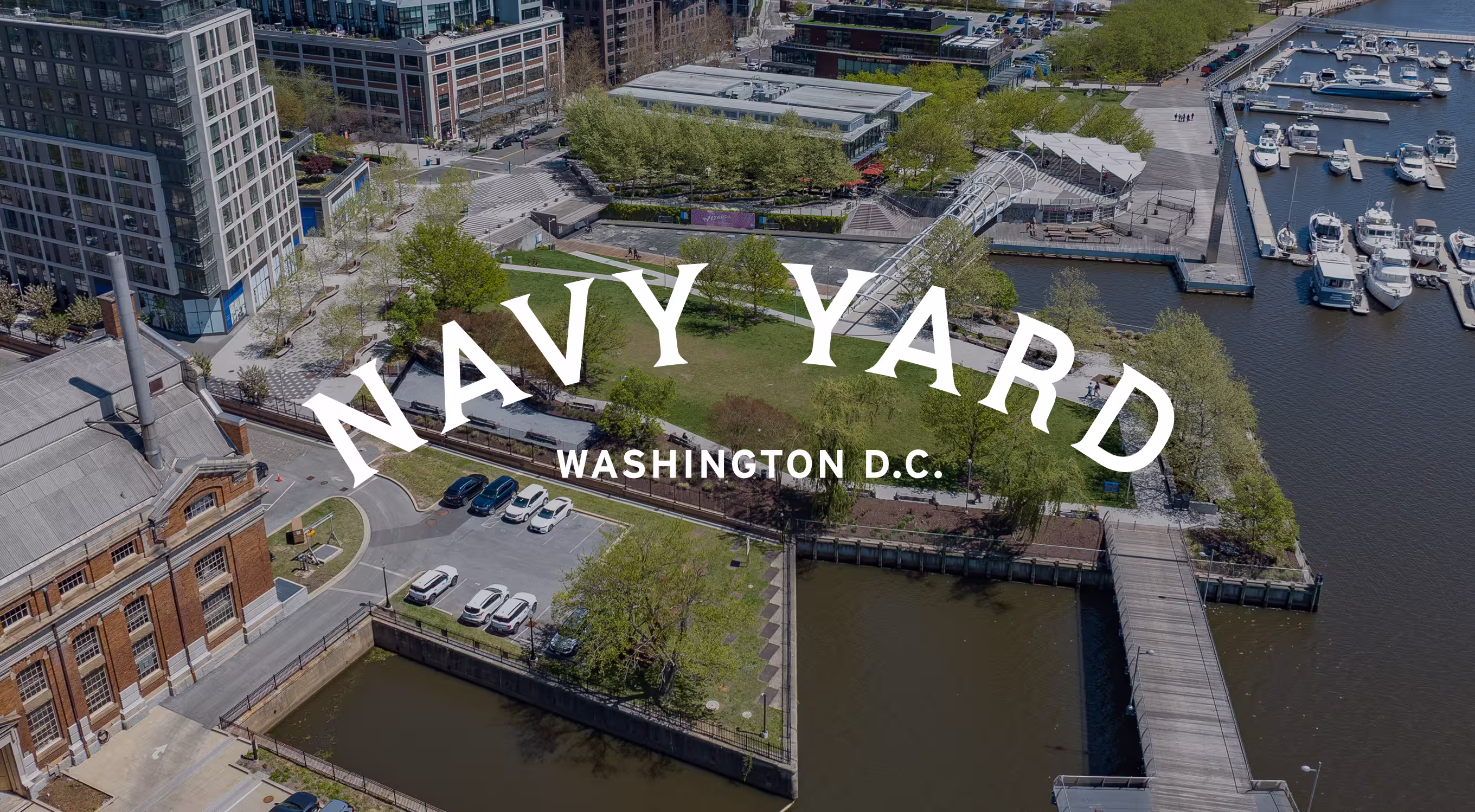
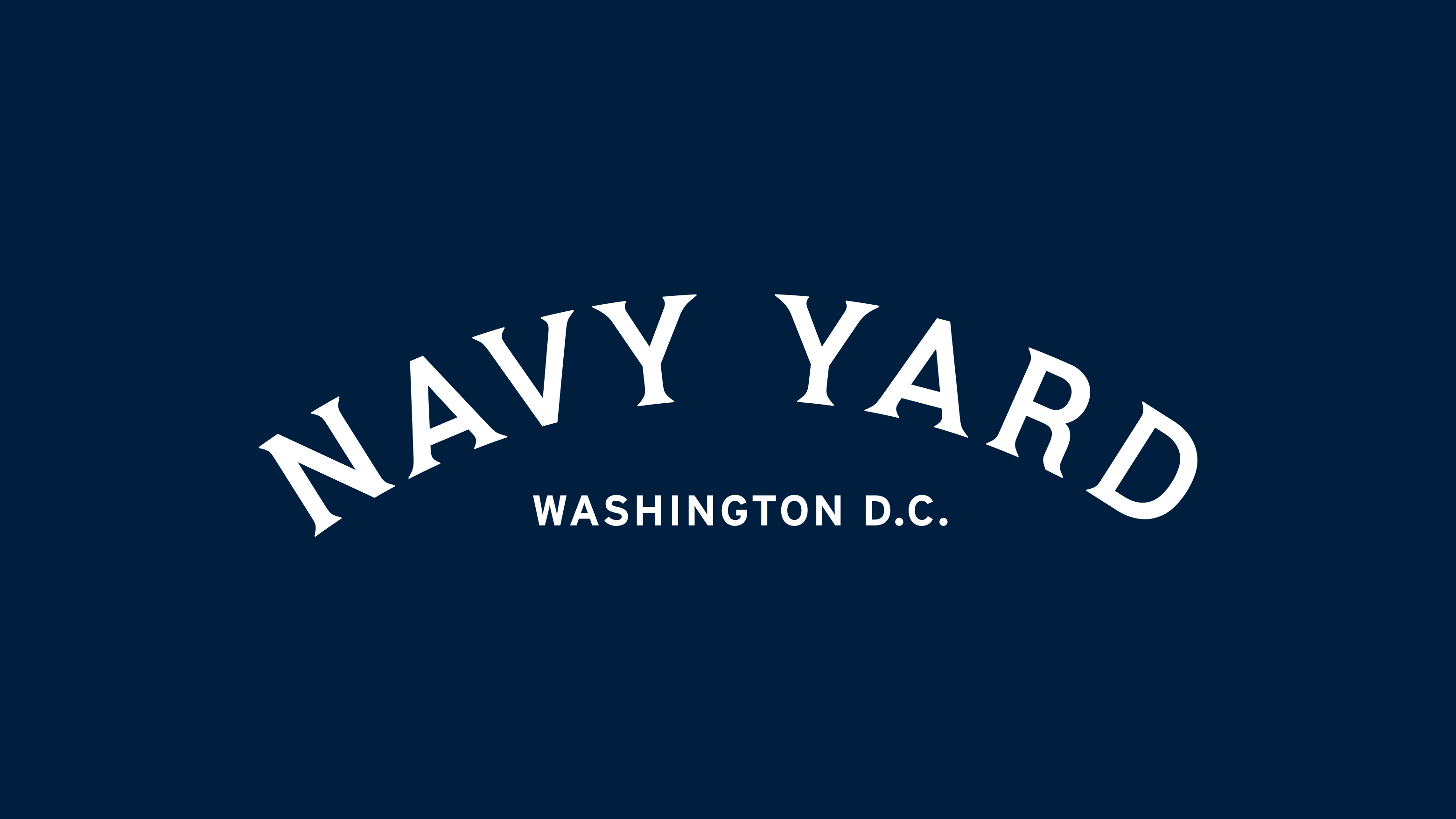
New Name,
New Logo.
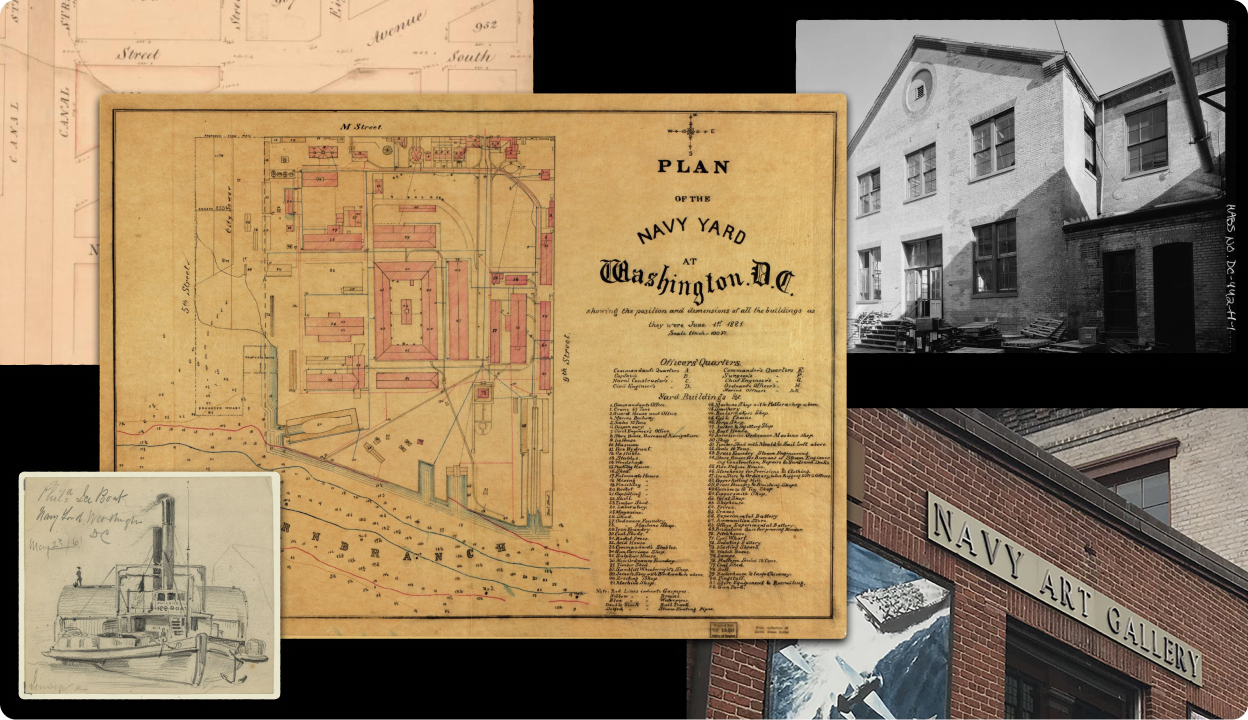
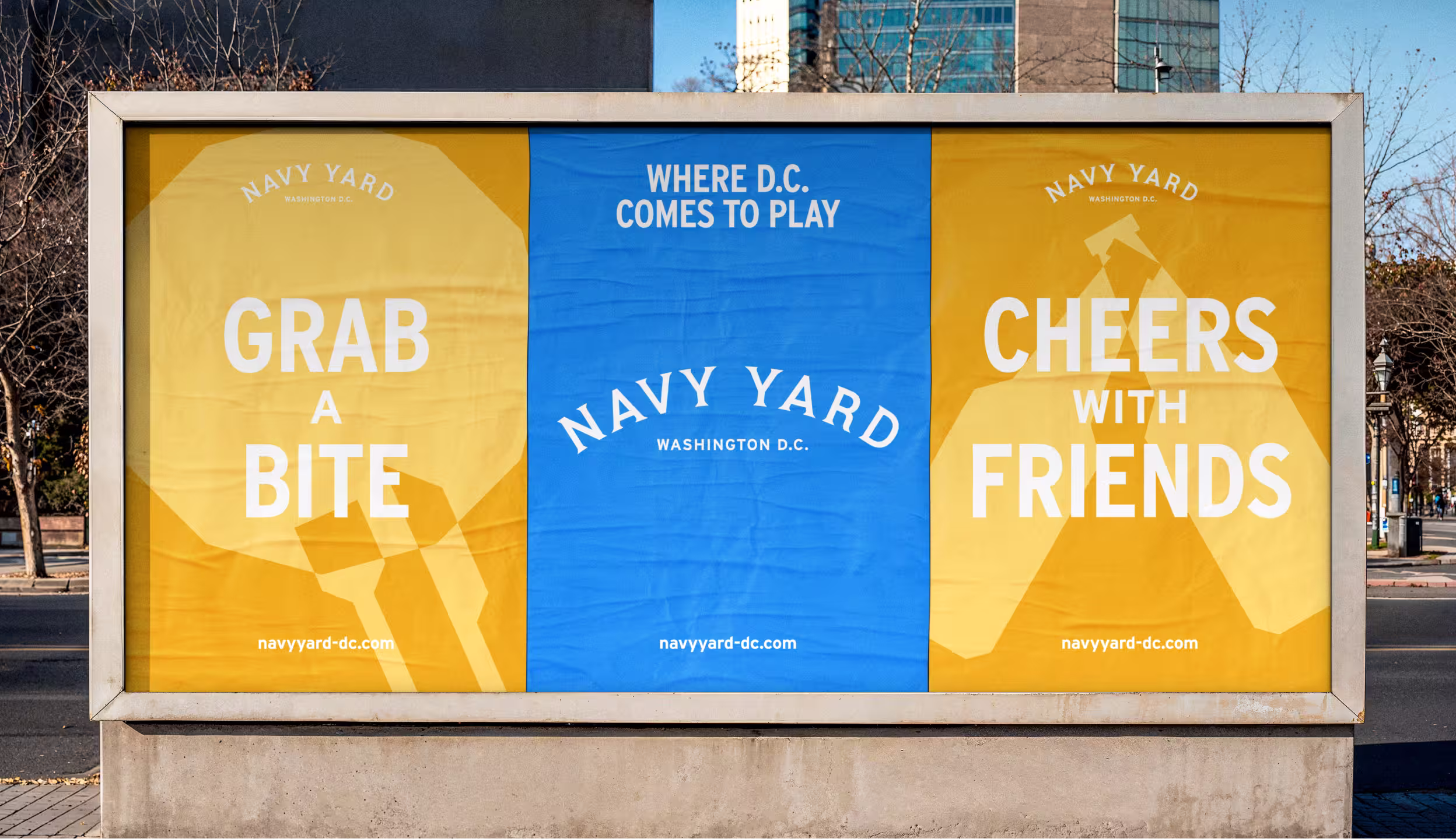
The new name was the easy part—it's what everyone already said. The harder challenge was designing an identity that could carry the energy, diversity, and ambition of the neighborhood. The Navy Yard wordmark is confident and contemporary, built to hold its own on street banners, social feeds, and signage across the district. Our new logo draws on inspiration from archival planning docs, dating back to the 1800s, when the area was still used as a naval base.
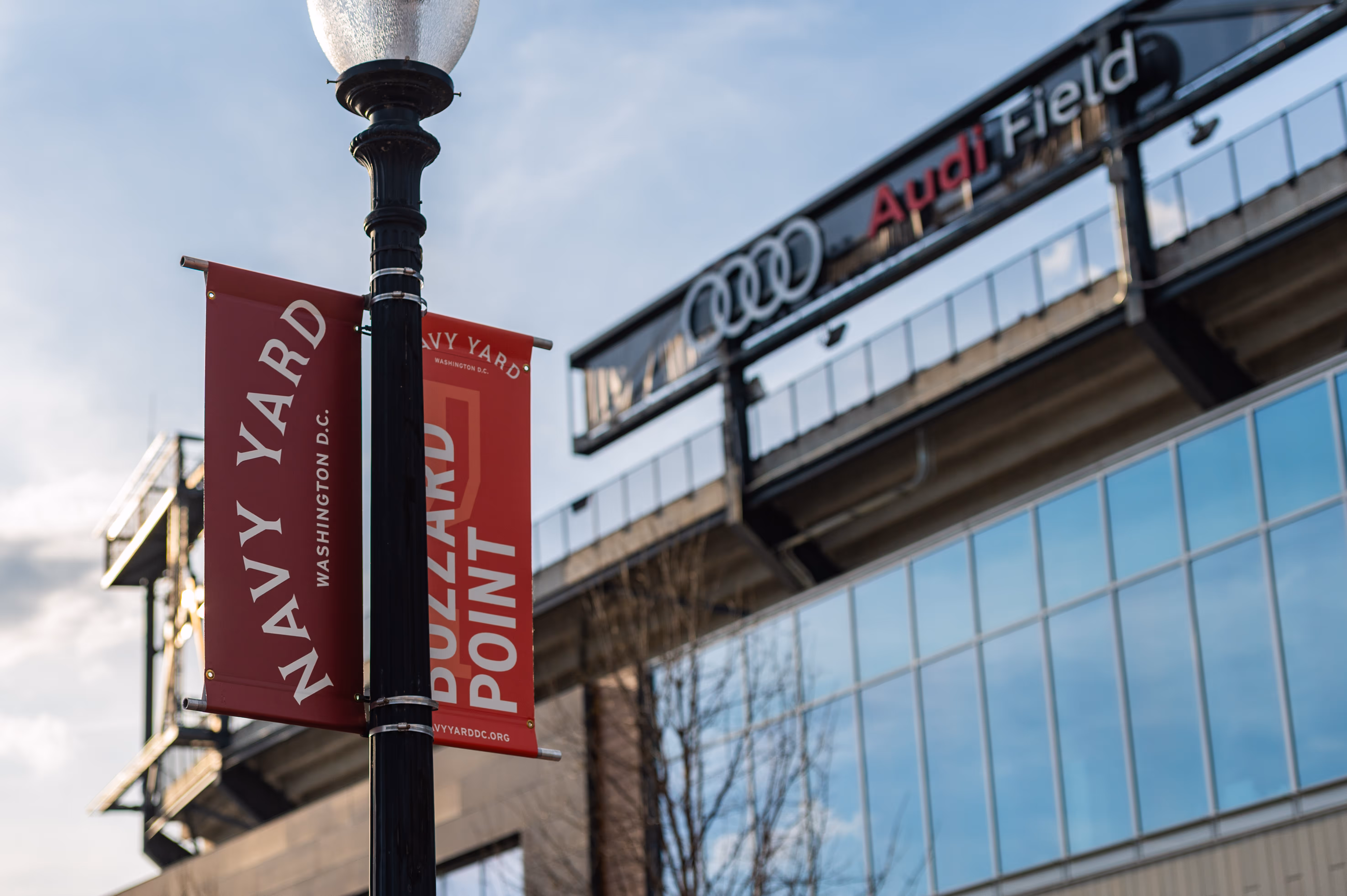
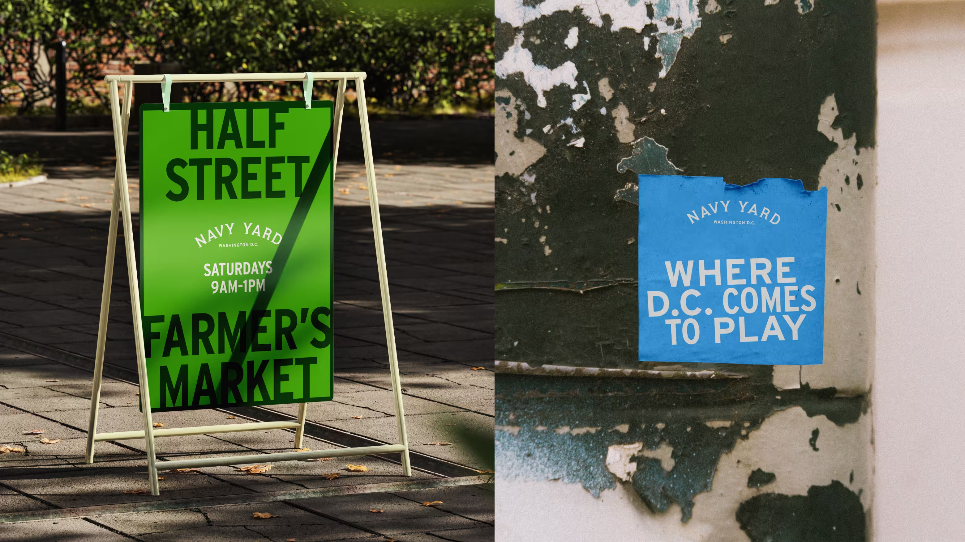
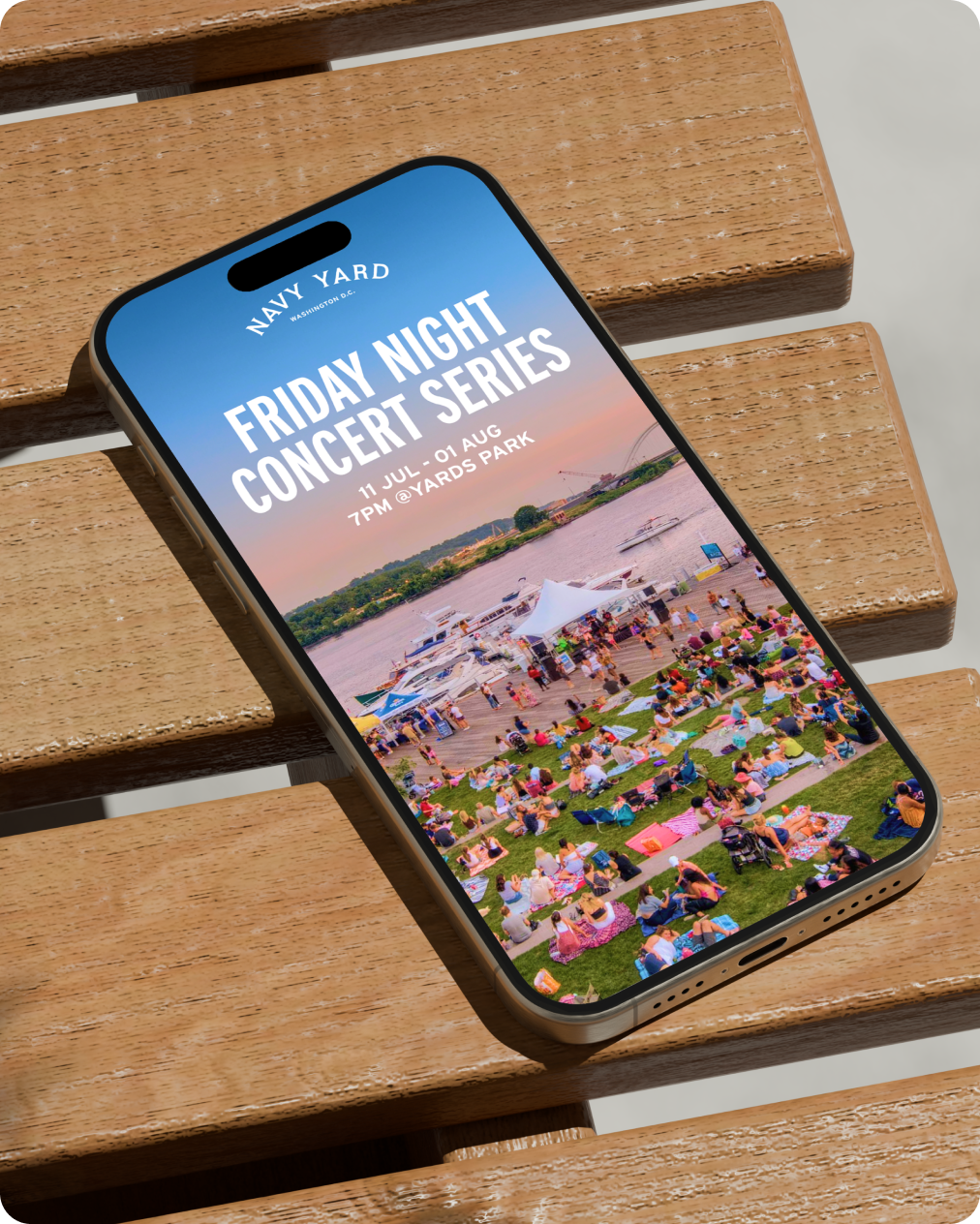
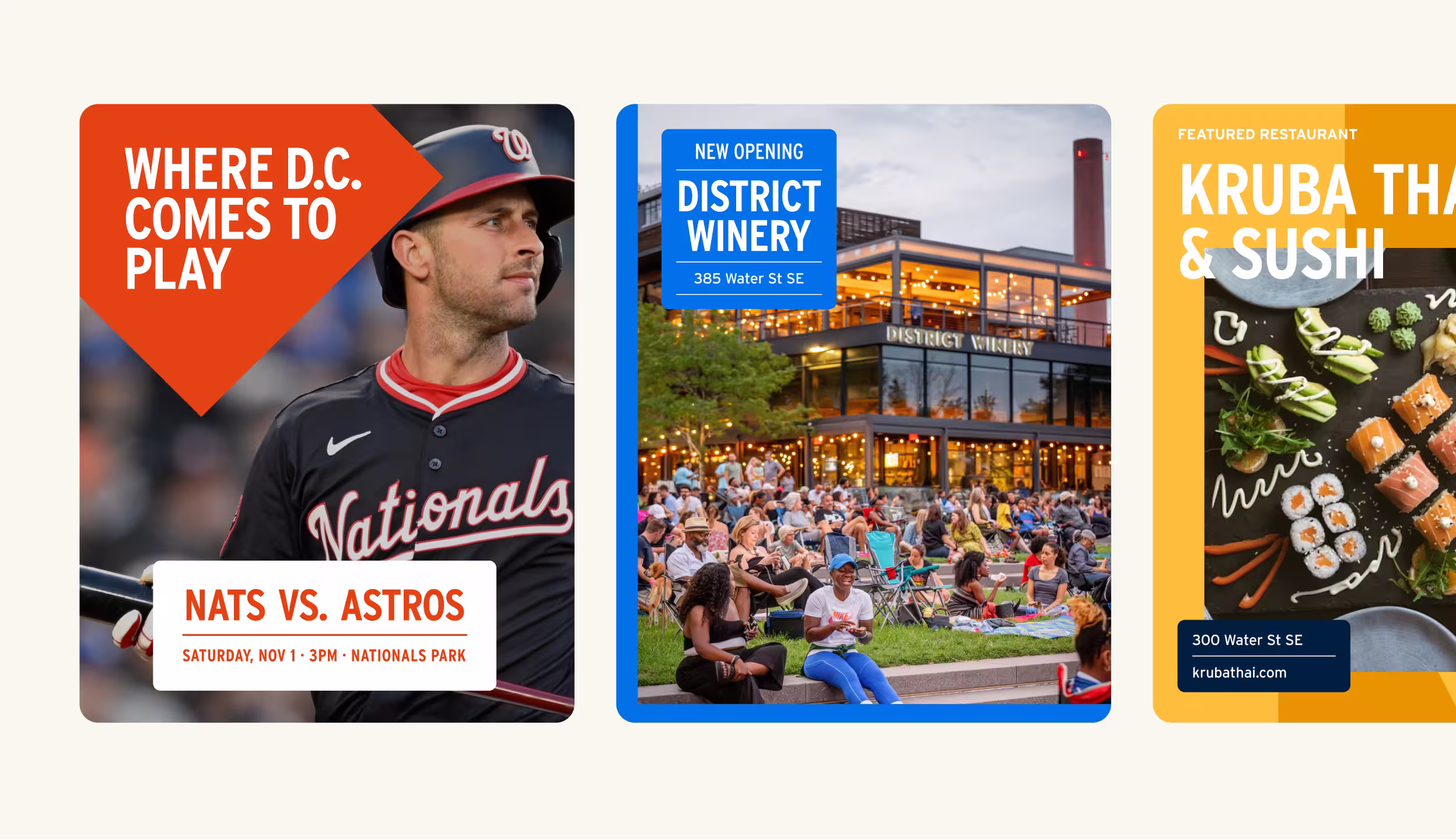
We designed the identity to flex across every touchpoint—from bold red-and-orange street banners lining the neighborhood to the BID's Instagram presence and wayfinding system. The new tagline, "Where DC Comes to Play," gives the brand a voice that's inviting and approachable, while speaking to all the ways people can 'play' in the neighborhood. At the ball game, at the park, or at any of the lively nightlife and entertainment spots in the neighborhood, play is always at the heart of it.
Color
The Navy Yard palette is rooted in the energy and textures of the neighborhood itself. A bold primary range of blues and warm reds captures the riverfront setting and the area's spirited game-day culture, while an extended set of accent colors—coral, golden yellow, grass, lavender, and more—gives the system range across seasons, campaigns, and community programming. Midnight Black and Cream ground the palette, ensuring clarity and contrast in everything from street-level signage to digital interfaces.

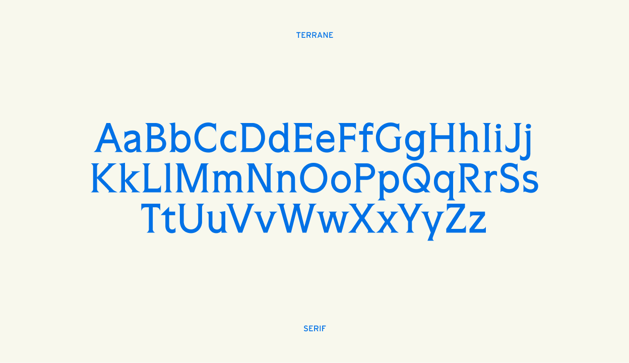
Typography
The type system is anchored by the Interstate family—a versatile, highly legible typeface that gives the brand a clean, municipal authority while still feeling warm and approachable. It works equally well at display scale on event signage and at body size in digital communications.
.gif)

Across the system, type is used to celebrate the neighborhood's distinct sub-areas—Capitol Quarter, Boathouse Row, Ballpark District, and others—each with its own character but united under a single visual language. The result is a typographic framework that scales from intimate community communications to large-format environmental graphics.
We extended the typographic system into motion, animating neighborhood names and brand messaging to bring the identity to life across digital platforms. Each animation reinforces the brand's kinetic, always-moving energy—a reflection of a neighborhood that never sits still.


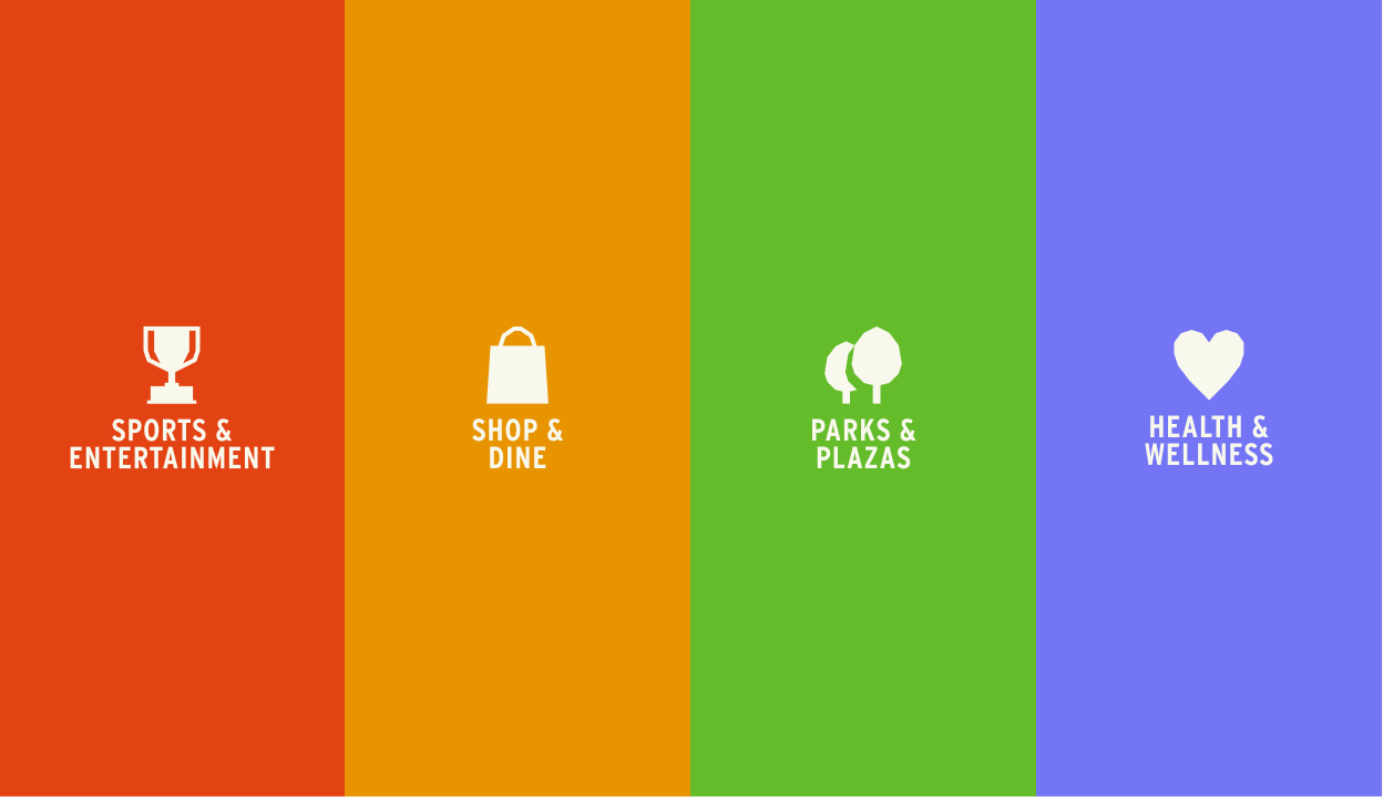
Icon Library
Navy Yard is a neighborhood defined by what you can do in it—catch a game, grab a meal on the riverfront, explore a park, break a sweat. We built a custom icon library to give those experiences a visual shorthand, creating a system of pictograms that maps the full breadth of neighborhood life.
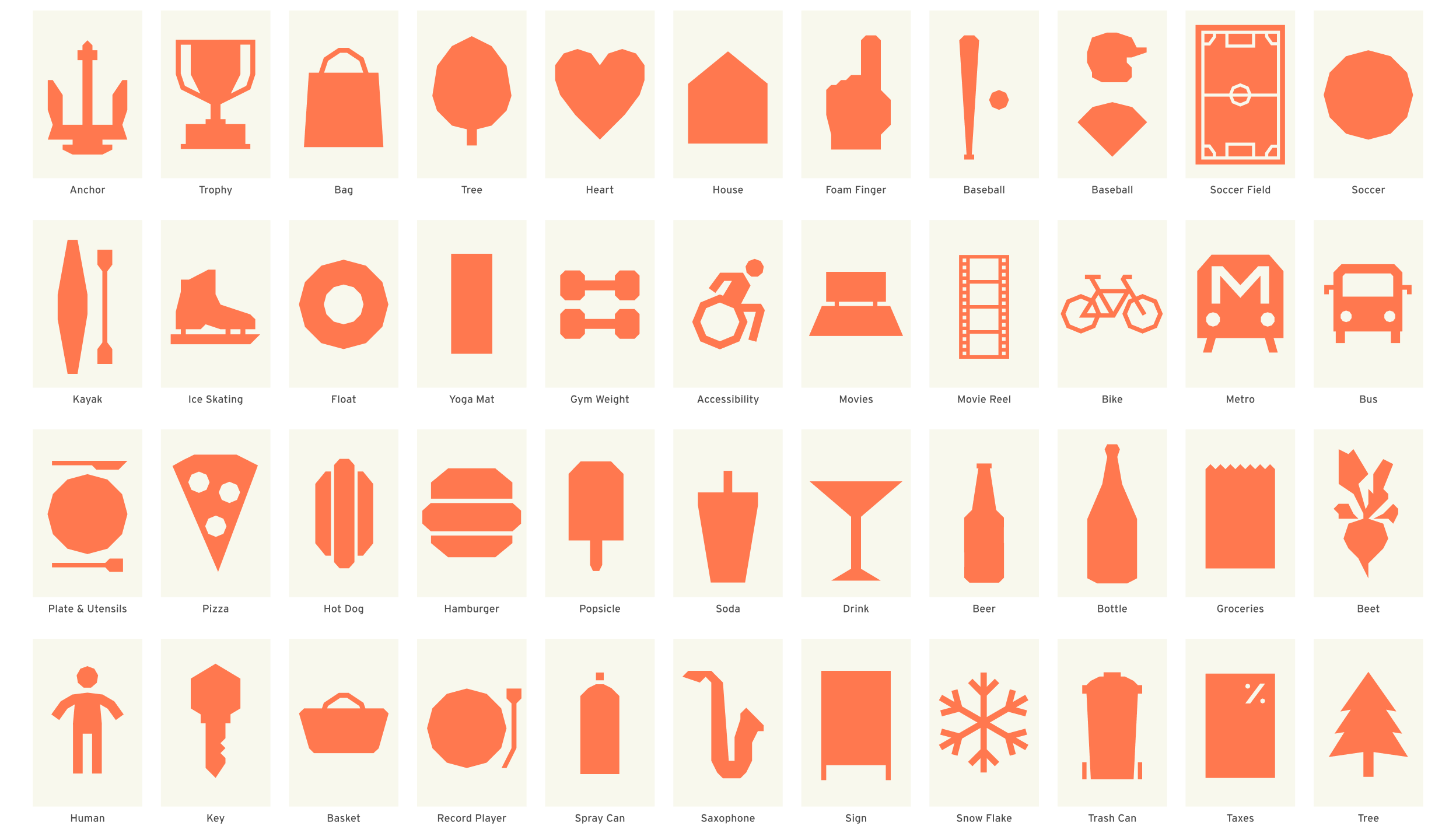
Each icon is designed to be used as a texture behind visuals—from digital patterns to oversized banners—and animated for use across social media and digital campaigns. The system is modular and extensible, built so the BID team can expand it as the neighborhood continues to grow.

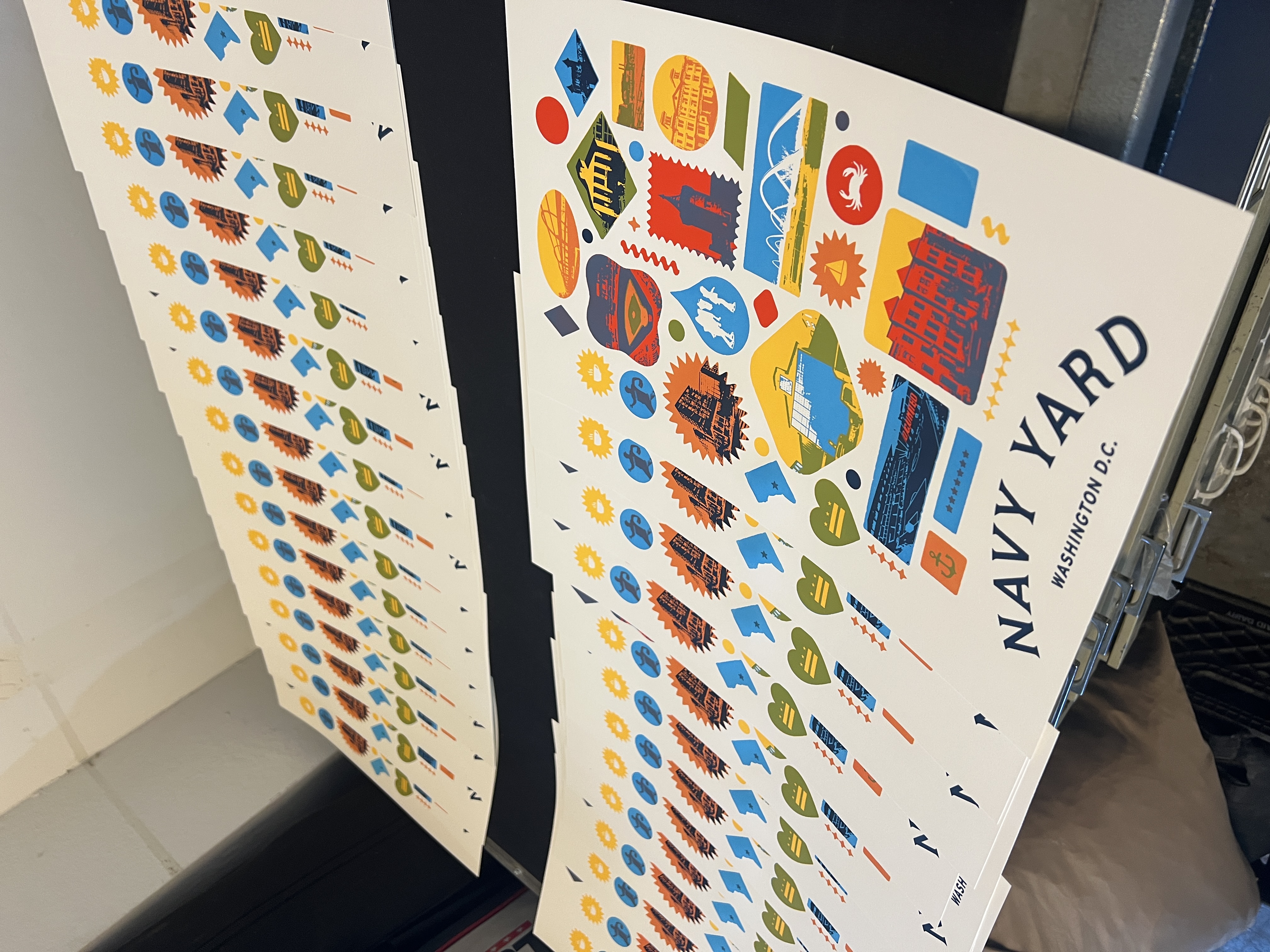
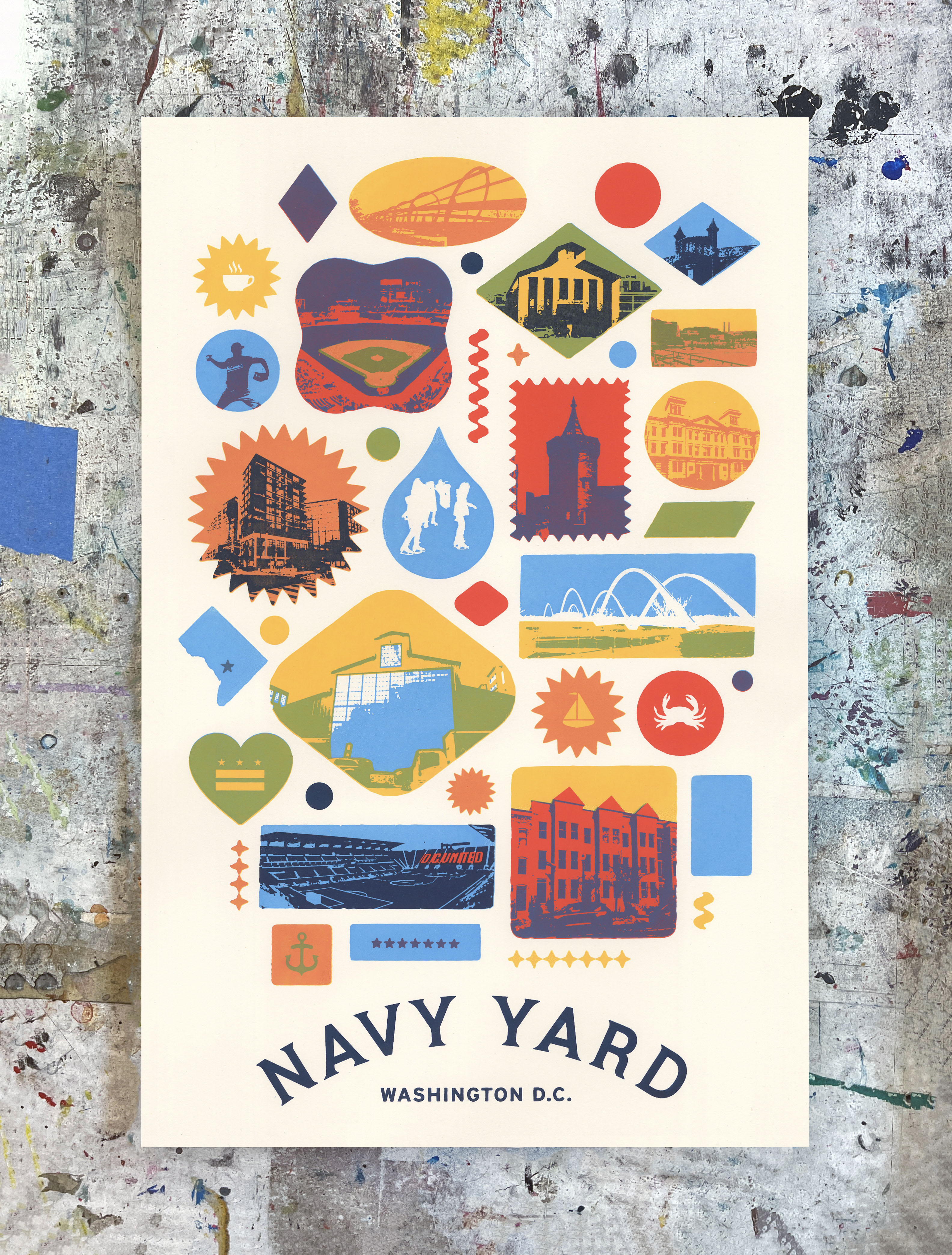
Commemorative Poster
We partnered with Anthony Dihle of Victory Dance Creative to design and screenprint a limited edition of 20 commemorative posters, to celebrate the launch of the new brand. Designed and printed in Washington DC.
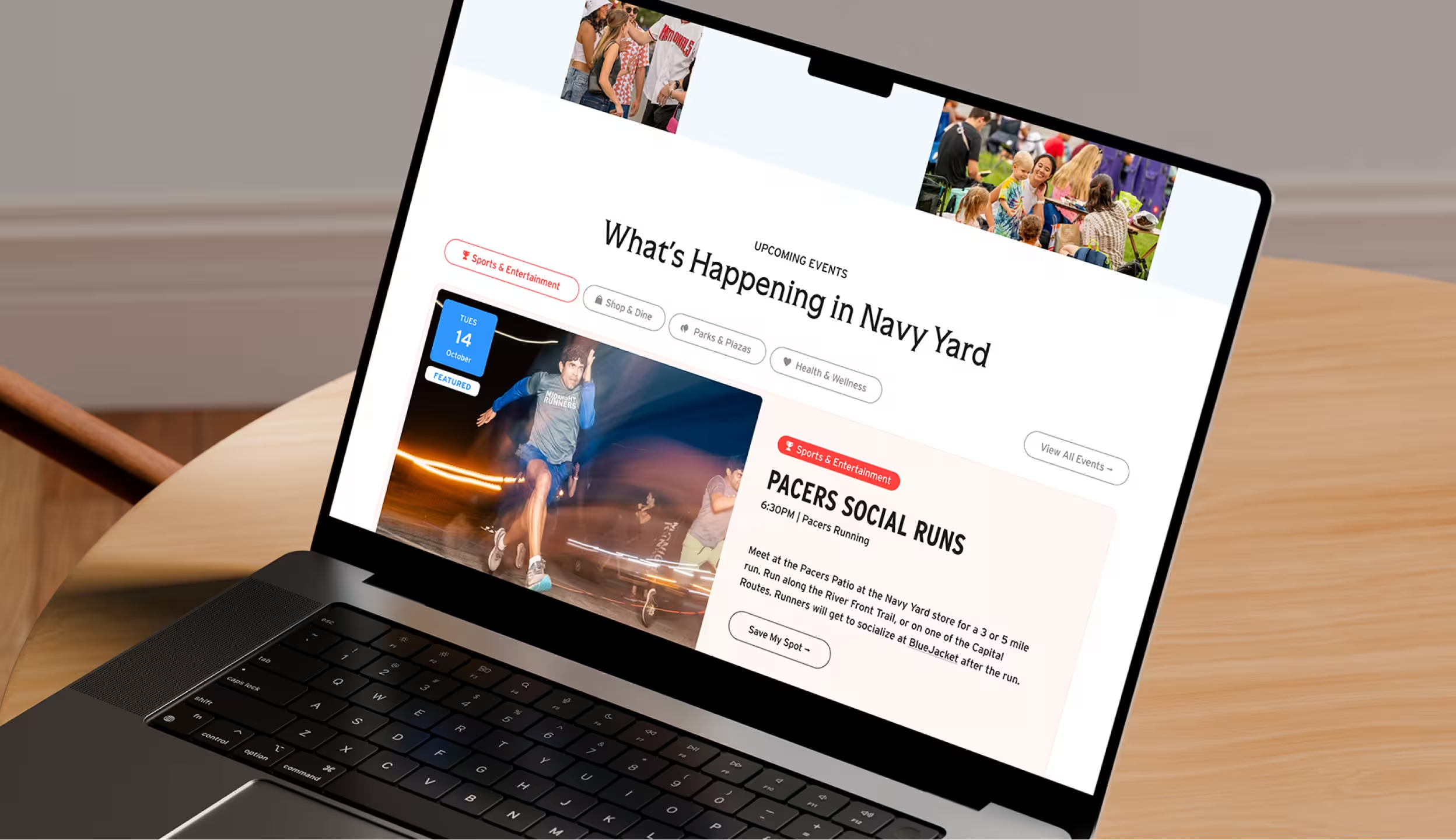
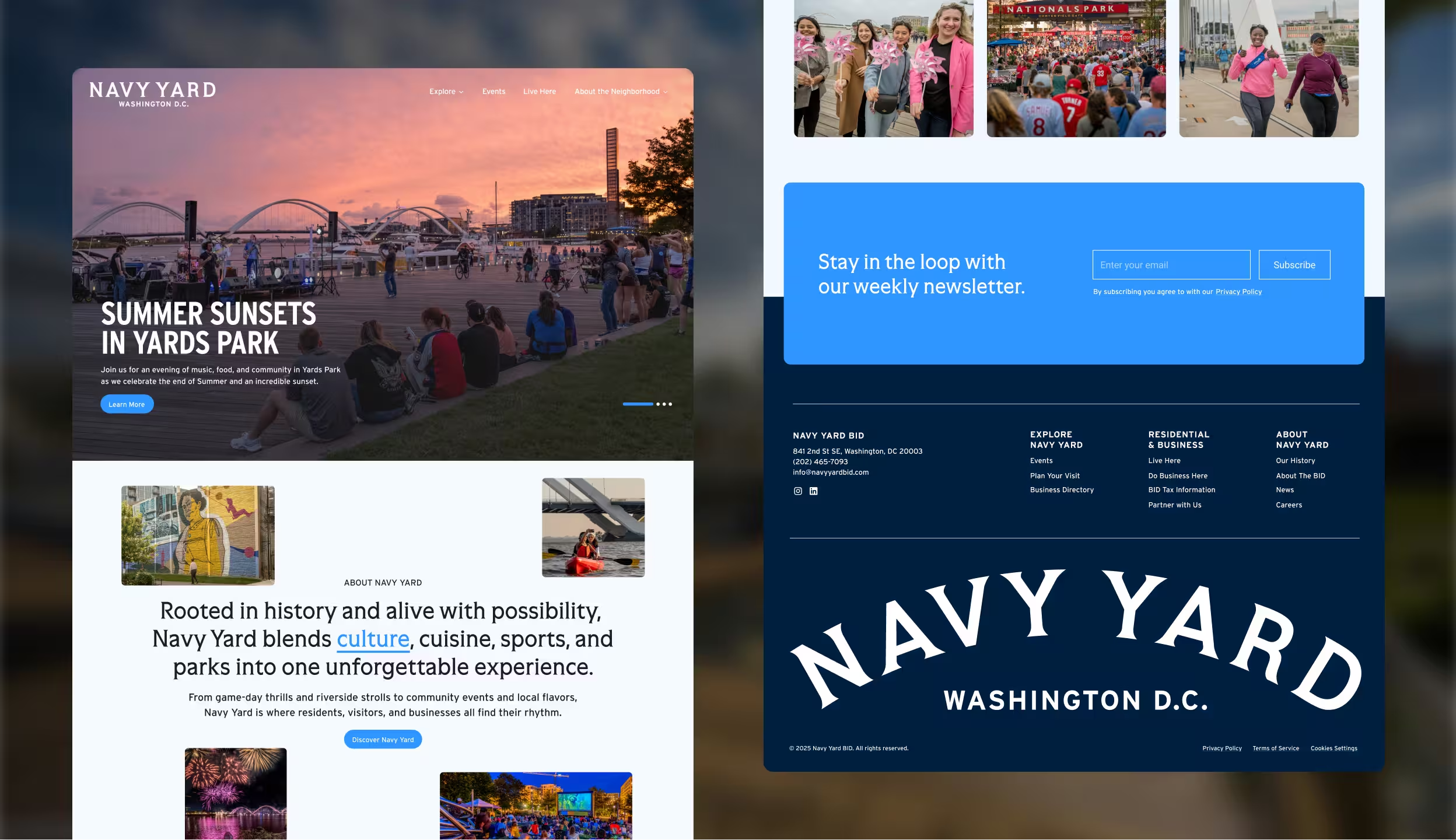
Website
The new navyyarddc.org is designed to be the digital front door for the neighborhood—a hub for events, dining guides, wellness programming, and community news. We rebuilt the site from the ground up to reflect the BID's expanded brand, with an emphasis on discoverability, seasonal content, and an experience that makes planning a visit as effortless as showing up.