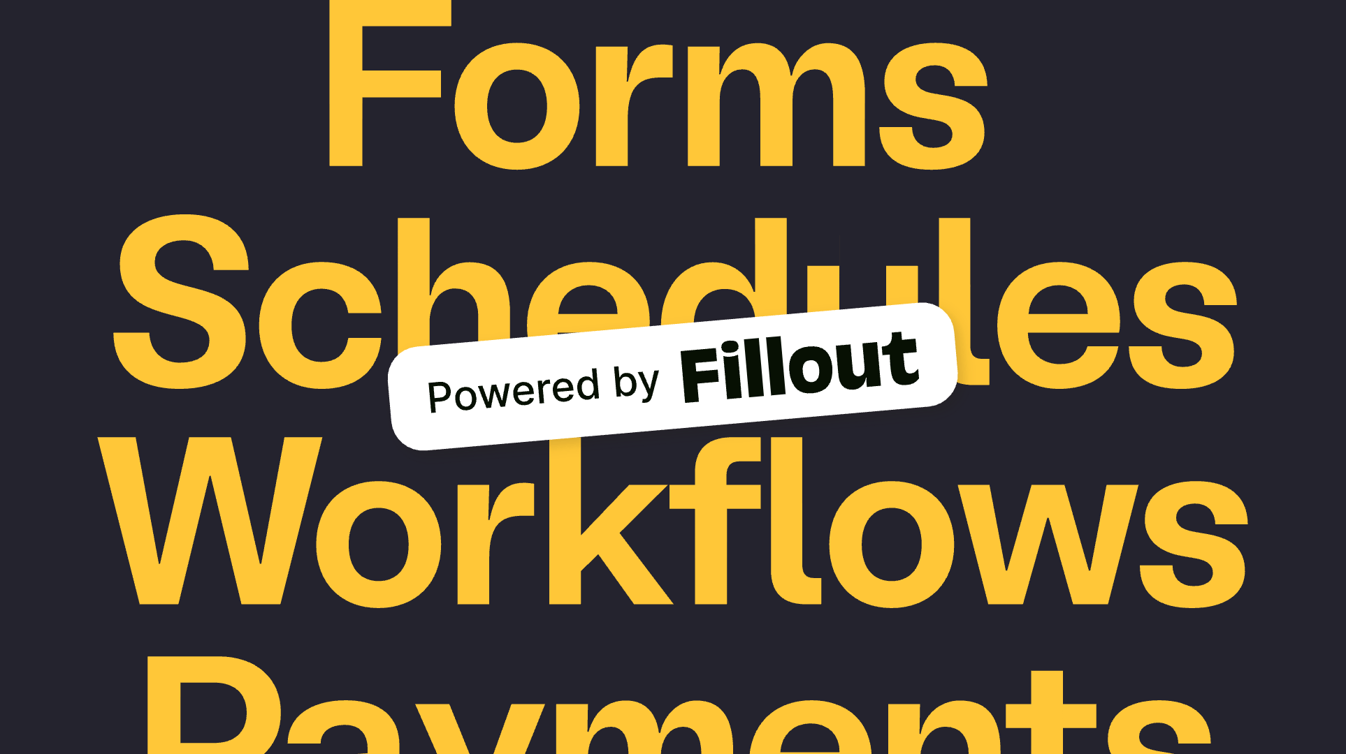
Forms are the connective tissue of every digital product—they handle signups, payments, scheduling, signatures, and everything in between. But most form builders treat branding as an afterthought. Fillout wanted to be the exception: a platform where every customer touchpoint could feel intentional and on-brand.

The approach
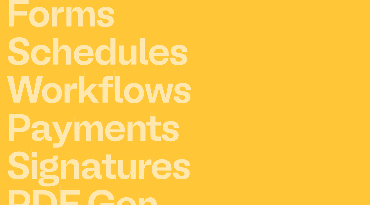
They came to us with an ambitious product and a clear gap. The tool could do it all—forms, workflows, scheduling, payments, signatures, PDF generation—but the brand needed to communicate that breadth without feeling cluttered or generic.

We leaned into Fillout’s core promise: forms that do it all. Rather than downplaying the platform’s density of features, we made it a strength—designing a brand system that could showcase breadth while maintaining clarity and delight at every level.


BL Melody was selected as the primary typeface, lending a friendly, approachable character that makes even the most functional content feel considered.

The visual system extends this thinking into every interaction. Feature categories—forms, scheduling, payments, workflows, signatures, PDF—are presented as distinct but interconnected modules, giving users a clear mental model of the platform’s capabilities without overwhelming them. The result is an interface that feels as intuitive as the product it represents.


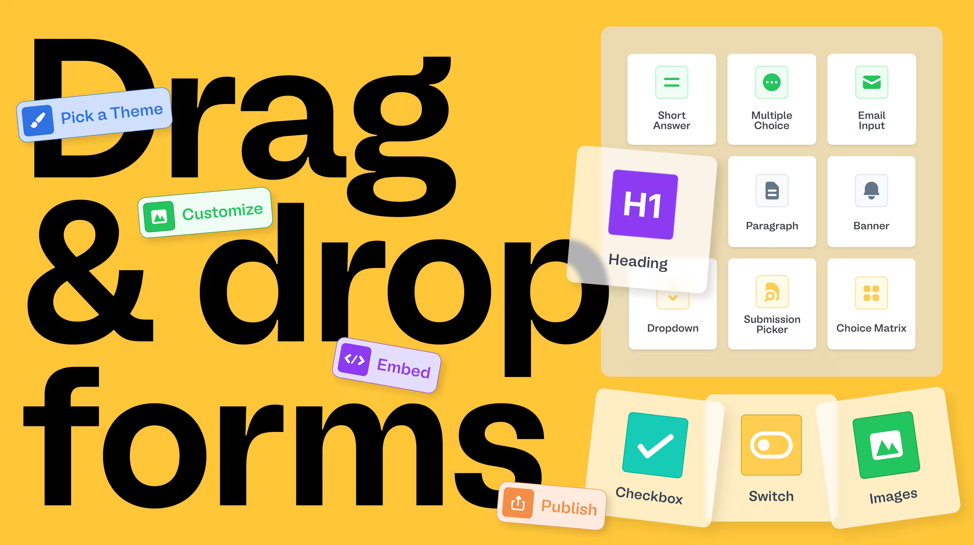
The identity embraces the drag-and-drop philosophy of the product itself. Illustrated UI components—switches, dropdowns, checkboxes, banners—become brand elements in their own right, creating a visual language where the product and the brand are inseparable. When you see the brand, you understand the product. When you use the product, you feel the brand.