Dopt was building something developers genuinely needed: a complete toolkit for crafting in-product userflows—onboarding sequences, feature discovery, activation moments. The product was sharp. The brand hadn’t caught up yet.
Partnering with Creative Director Shane Zucker and Design LOL, we set out to create an identity that could speak two languages fluently: the precision developers expect and the creative energy that makes a product feel like it was built by people who actually enjoy what they do.
The Approach
The Dopt product lives between layers of UI—the invisible logic that powers what users see and feel. We translated that concept into every dimension of the brand. The primary logo uses a distinctive dropshadow that hints at depth and layering, a visual nod to the product’s role in connecting the surfaces of an interface to the systems beneath.
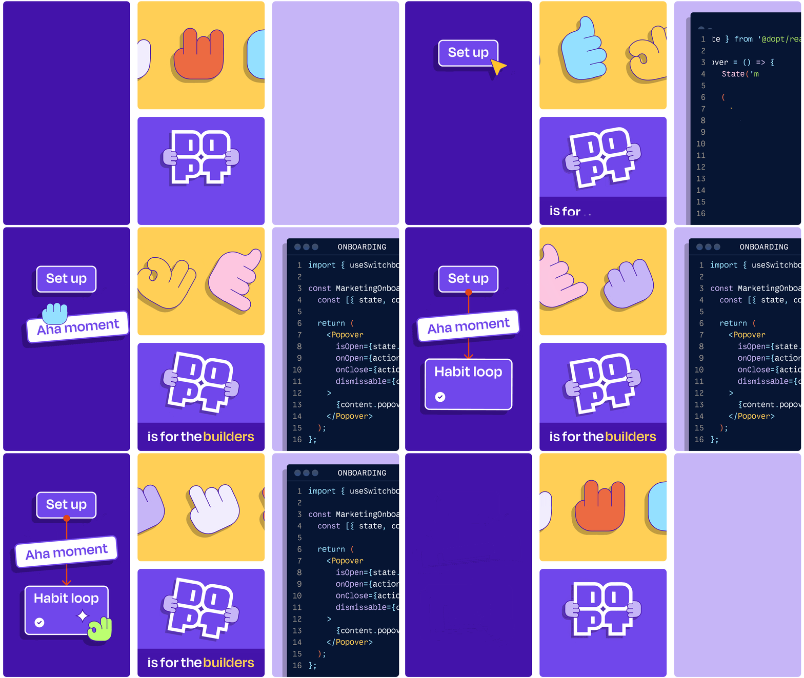
We developed a block system—modular visual components in four arrangements and two styles—that mirrors the composable nature of Dopt’s APIs and SDKs. Paired with a library of hand gestures and emoji-style icons, the system gives the brand a toolkit of its own: flexible, expressive, and infinitely reconfigurable.


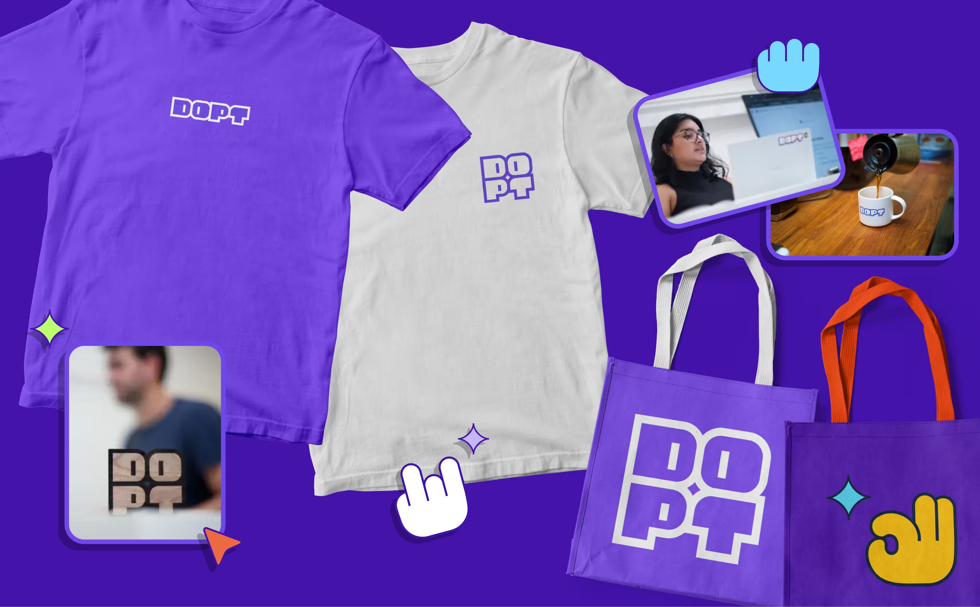
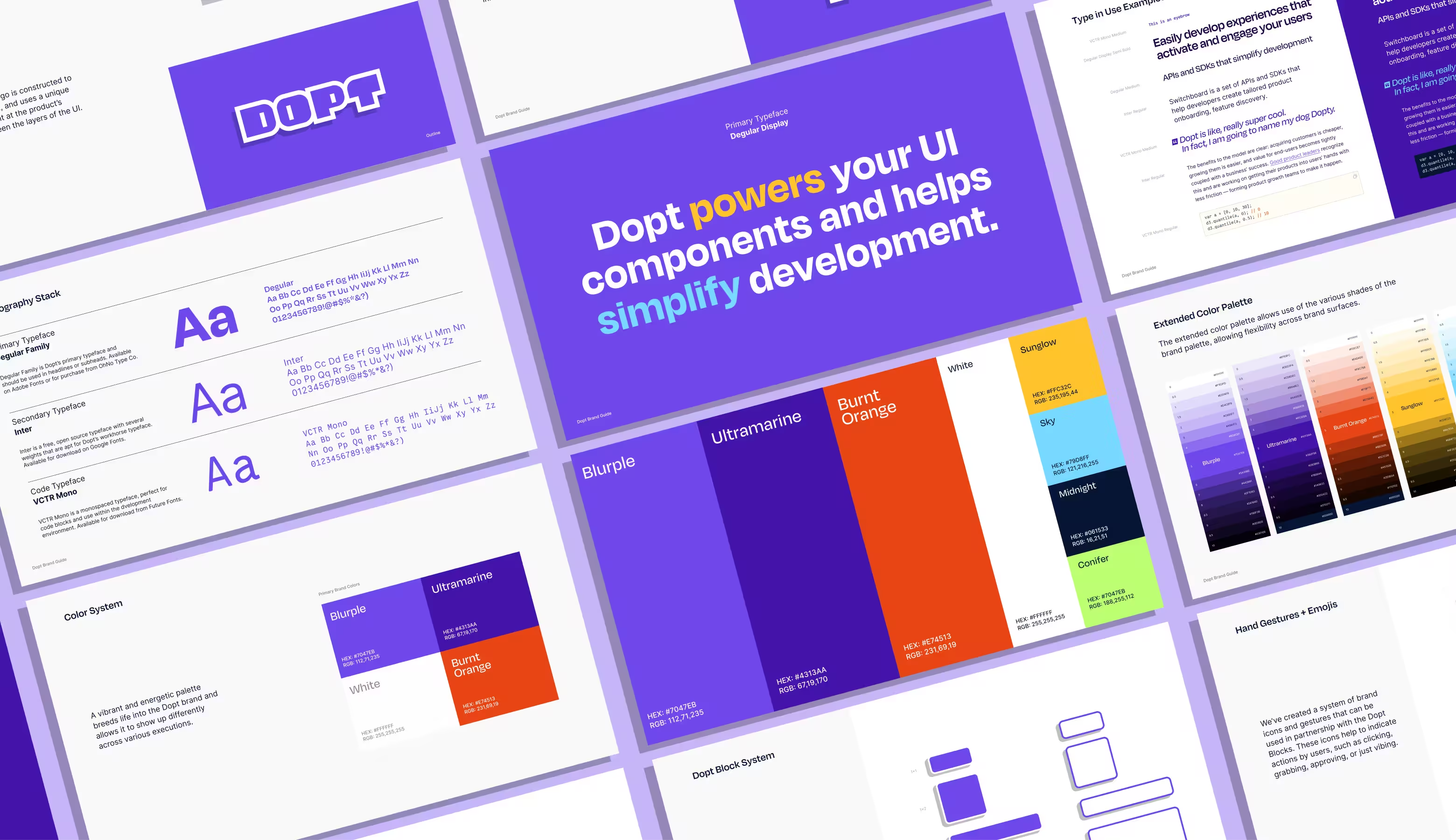
The color palette is unapologetically vibrant. Blurple and Ultramarine anchor the system with developer-world credibility, while Burnt Orange, Sunglow, Sky, and Conifer expand the range—giving Dopt permission to show up differently across marketing, documentation, product UI, and swag without ever losing coherence.
Typography follows the same logic. Degular Display leads with personality in headlines. Inter handles the heavy lifting as the workhorse body typeface. And VCTR Mono brings authenticity to code blocks and developer-facing content—because a brand that serves engineers should feel native to their environment.
A full dark-mode syntax color system rounds out the identity, ensuring the brand feels just as considered inside a code editor as it does on a billboard.


The result is a brand that feels like the team behind it—technical, playful, and built to scale. The identity gave Dopt the visual confidence to stand out in a crowded developer tools landscape, translating seamlessly from pitch decks to product interfaces to conference booths.
In 2024, Dopt was acquired by Airtable—a testament to the strength of both the product and the brand we helped build around it.


