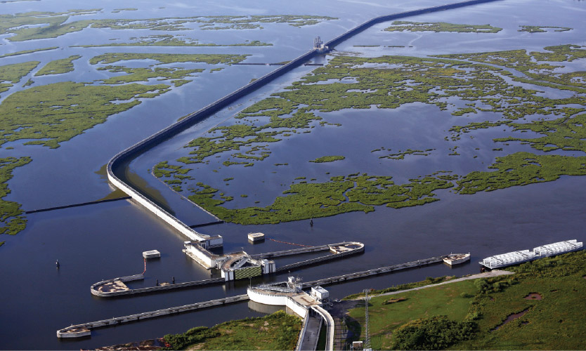
In 2016, Tulane University launched the ByWater Institute with an ambitious mandate: lead the innovation of water research through transdisciplinary collaboration—starting in the Mississippi River Basin, with a blueprint designed to scale nationally and globally. The science was groundbreaking. The brand wasn’t keeping up.
ByWater needed an identity that could hold the weight of its research while communicating with the warmth and urgency its community-centered work demands. One that could live on an academic campus and resonate far beyond it.


We started with the institute’s founding philosophy: that thriving water futures depend on collaboration across disciplines, communities, and ecosystems. That idea—of interconnection—became the conceptual backbone of the entire identity.
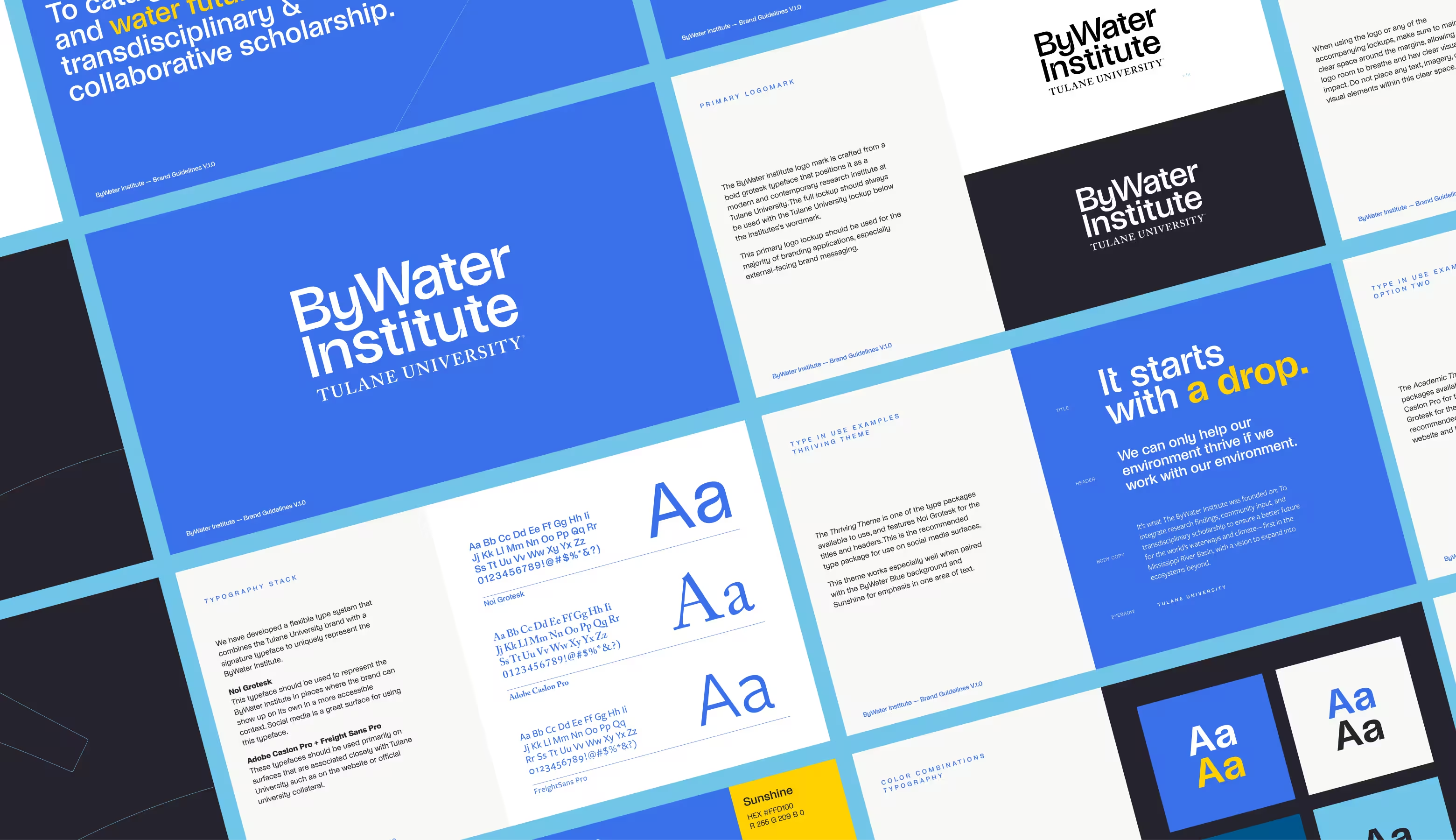
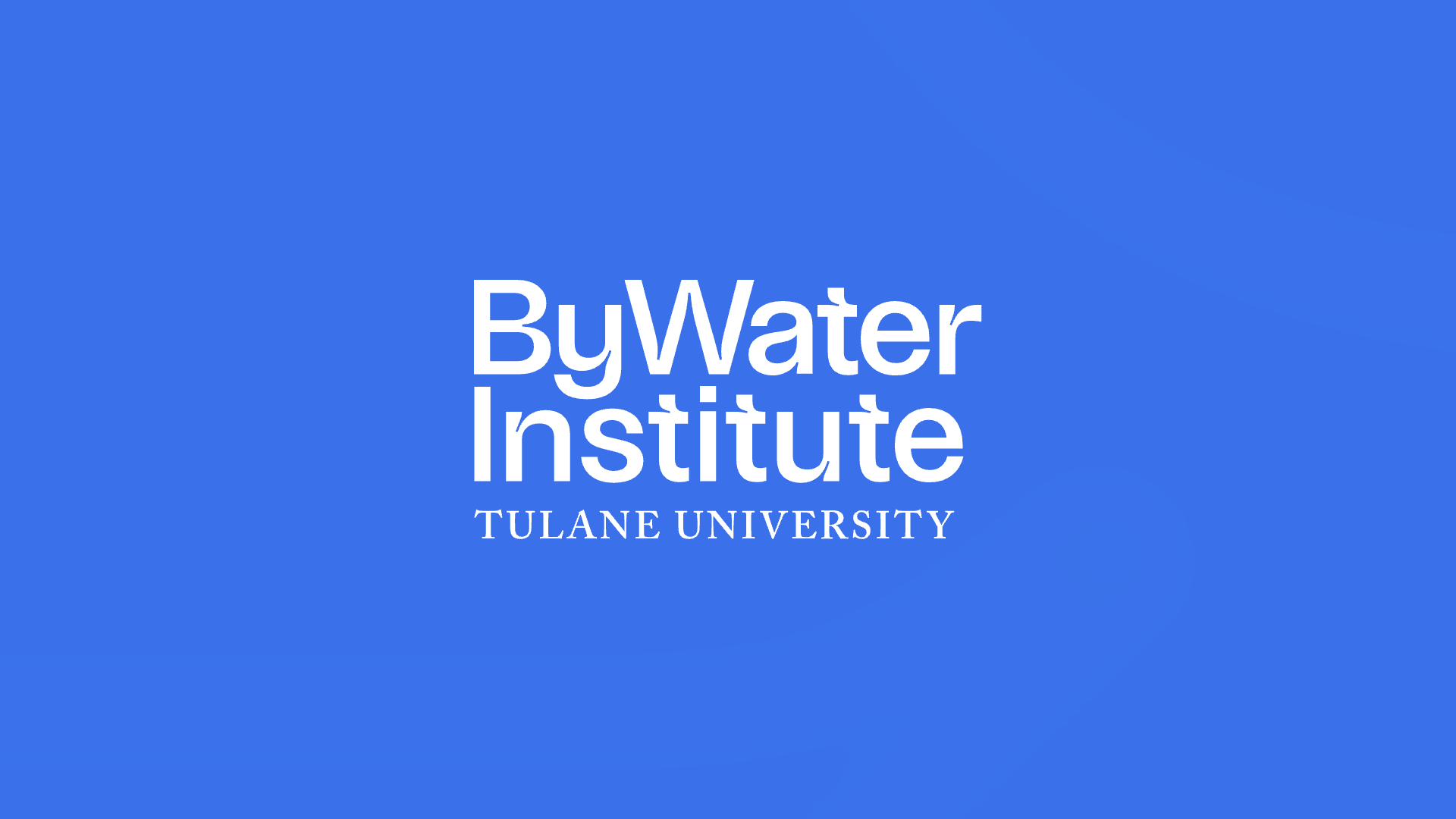
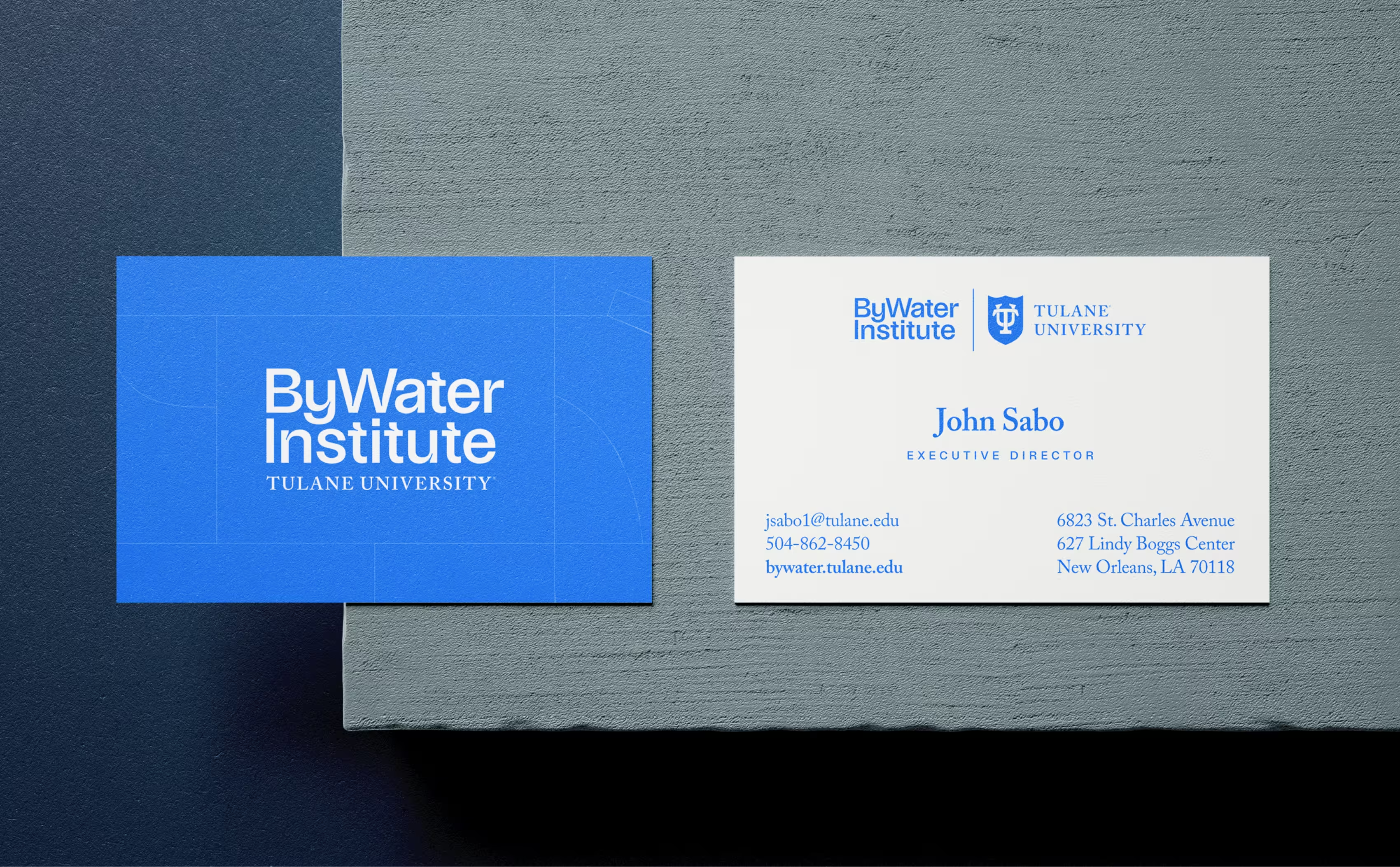
The visual system draws from the movement and behavior of water itself. A bold grotesk logotype positions ByWater as a
modern, contemporary research institute—a deliberate departure from the traditional academic aesthetic—while a
dual-theme typographic system bridges two audiences: the broader public through Noi Grotesk’s accessible energy, and the university community through the institutional gravitas of Adobe Caslon Pro and Freight Sans Pro.

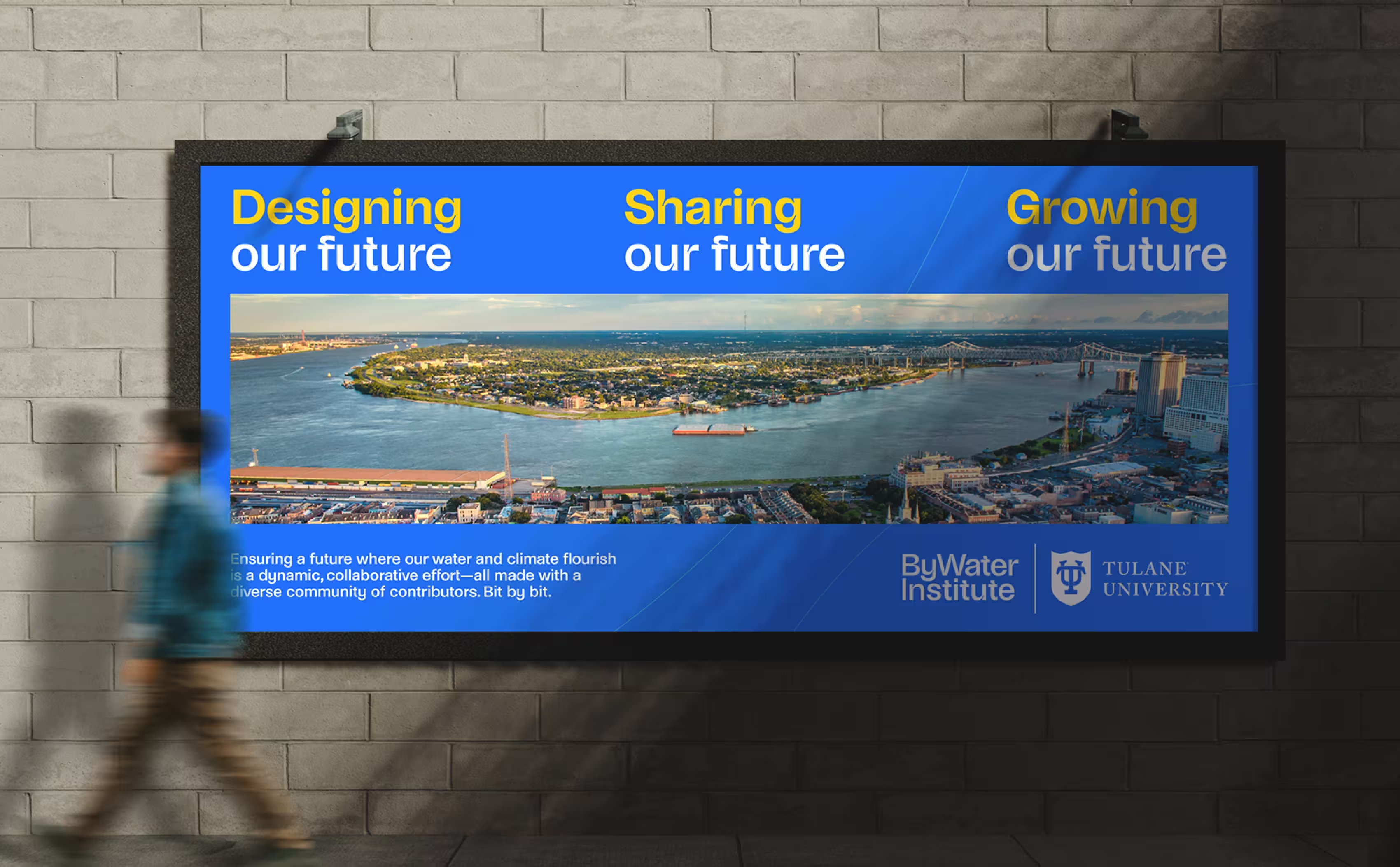
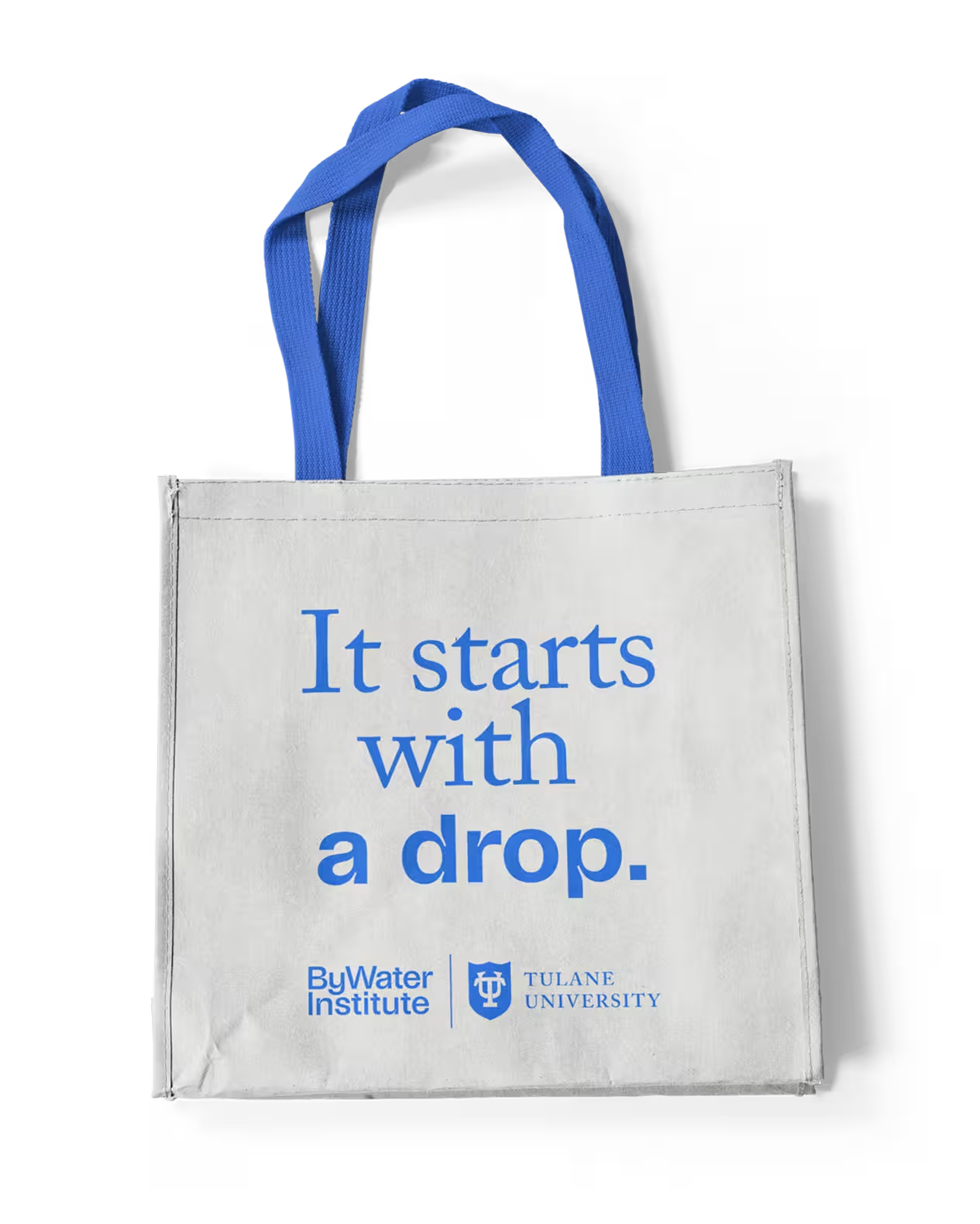
The color palette is rooted in ByWater Blue—a deep, electric hue that evokes both the urgency of climate science and the vitality of healthy waterways—accented with Sunshine Yellow for emphasis and optimism. Every color combination was tested for accessibility, ensuring the brand communicates clearly across every surface and context.


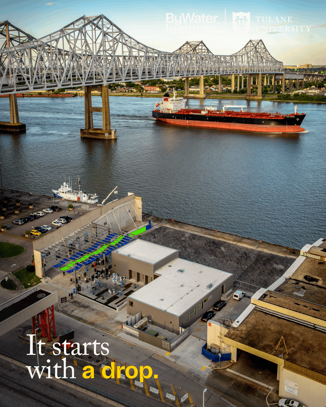
“It starts with a drop.” That line became the brand’s rallying cry—a distillation of ByWater’s belief that large-scale environmental impact begins with singular, focused action. It anchors the messaging hierarchy and sets the tone for how the institute speaks to the world: direct, hopeful, and grounded in science.
We built a flexible brand system designed to serve the full spectrum of the institute’s work—from academic papers and fellowship programs to social media and community engagement.
The Thriving Theme brings warmth and energy topublic-facing communications. The Academic Theme maintains rigor for research contexts. Together, they give ByWater aunified voice that adapts without losing coherence.
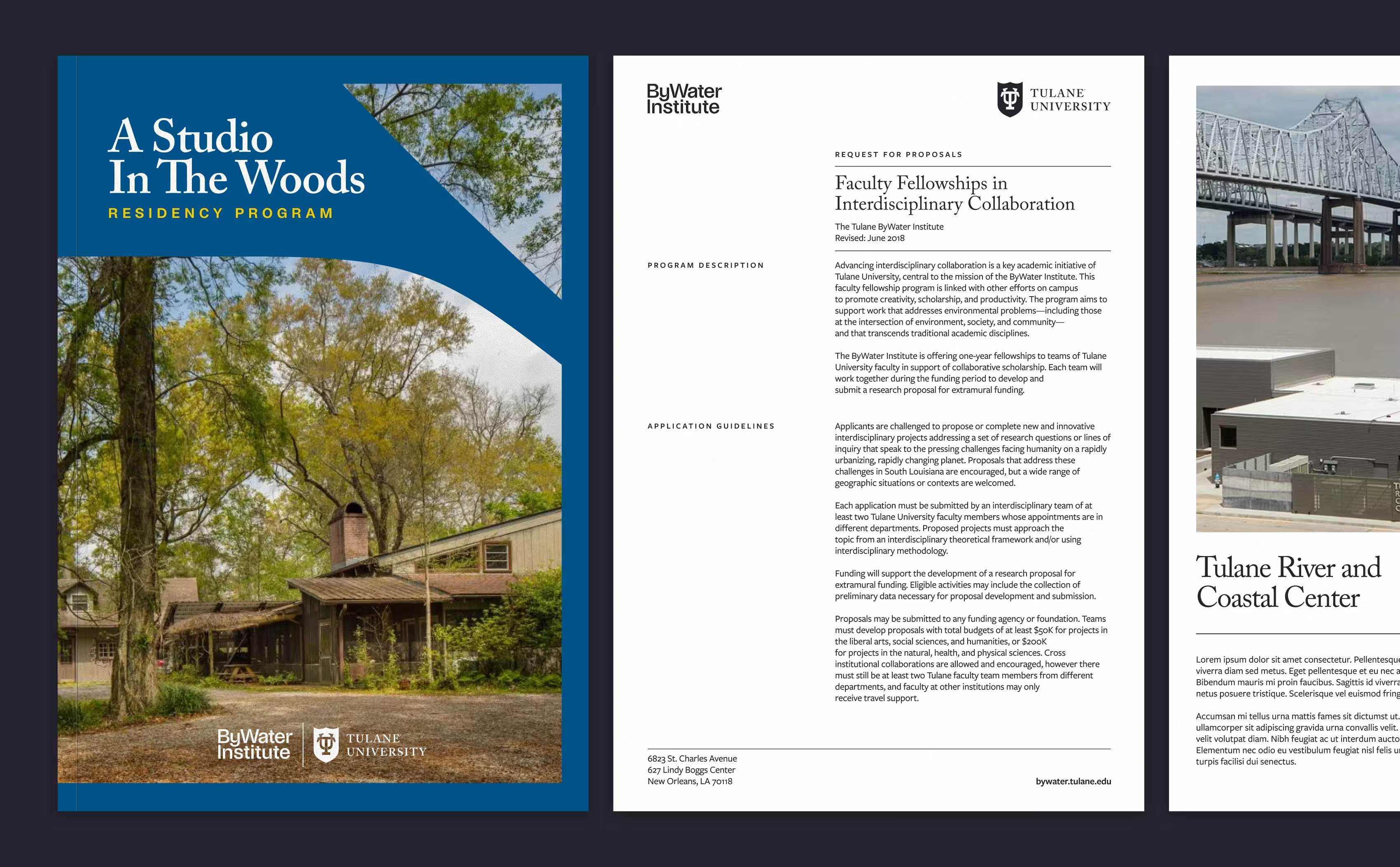
The new identity repositions ByWater as what it always has been—a forward-thinking, solutions-driven research hub—but
now with the visual authority to match. From its home at the Tulane River and Coastal Center to A Studio in the Woods
fellowship program, the brand scales seamlessly across physical spaces, digital platforms, and branded materials.


What was once a university department that needed explaining is now a brand that needs no introduction—one that invites researchers, policymakers, and communities to join a movement already in motion.